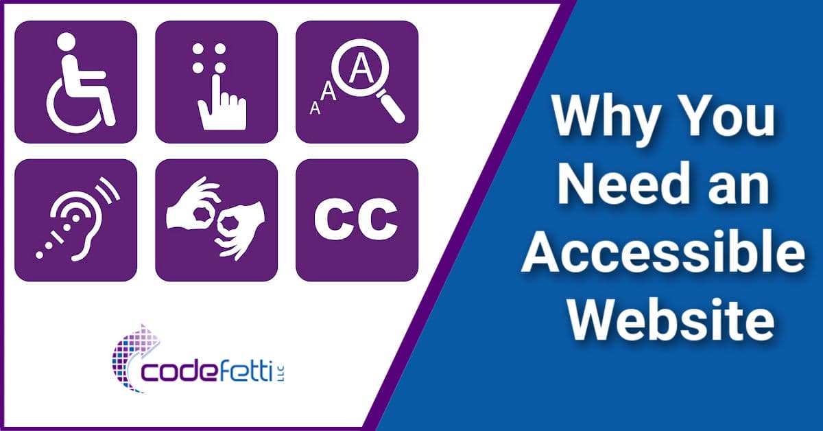
Why You Need an Accessible Website

You’ve likely heard about website accessibility and may be wondering why you need an accessible website.
You may not know where to begin or if accessibility even applies to your website. It does!
I’ve been there, too, and I wrote this post to share what I’ve learned from my experience.
My hope is to answer your basic questions and guide you on why you need an accessible website.
We’ll cover:
- The Americans with Disabilities Act (ADA)
- Web Accessibility in Mind (WebAIM)
- Web Content Accessibility Guidelines (WCAG)
- Levels of Compliance
- Four Principles of POUR
Once you read this post you should have a basic understanding of ADA compliance.
When you’re done reading this post, you’ll next want to read my article on how to make your WordPress website accessible.
And then make sure to read how to improve web accessibility for low vision users.
Quick Links
What is an Accessible Website?
ADA since 1990
Four Principles of POUR
Disclaimer
A Word About Userway and Overlays
My Approach
Levels of Compliance
Additional Reading
What is an Accessible Website?
Simply put, a website is accessible if it can be used by people of all abilities.
This includes any type of physical or mental disability that limits a person’s movements, senses or activities.
These limitations or disabilities, as applied to websites, include people who are:
- Blind
- Vision impaired
- Color blind
- Deaf
- Hard of hearing
- Cognitively disabled
- Physically impaired (can they use a mouse or keyboard)
The bottom line is this: as business owners and web designers, we have a moral responsibility to provide website content that can be accessed, consumed, and understood by people of all abilities.
This also means that we will likely need to forego our flashy user interface with its corresponding WOW factor for simpler, more accessible websites.
A cleaner, simpler user interface will benefit everyone, not just the disabled. And a simple site will load faster, too!
Beyond that, we need to ensure that our mobile sites are accessible, too.
Why Accessibility is Important
But why is all of this such a big deal these days?
Because disabled people are a BIG demographic!
Statistics cite that 15% of the world’s population experience some sort of disability.
This includes the aging population who begin to experience vision, hearing and cognitive issues.
Many of these people need assistance or special devices to use the internet such as:
- Adaptive keyboards
- Screen magnification software (often built into the browser)
- Screen readers, which read website content out loud
- Text to speech software (TTS)
- and more
So it’s important to remember these visitors, and make efforts to improve web accessibility for low vision users, too.
Hopefully by now you can see why website accessibility is important.
And why each of us needs to do our part to make the internet usable for everyone.
ADA Since 1990
The Americans with Disabilities Act (ADA) is a civil rights law that went into effect on July 26, 1990. This act was designed to prohibit discrimination against people with disabilities, and to ensure they can enjoy the same opportunities as everyone else.
For example, we’ve seen how commercial properties have accommodated disabled patrons.
From handicapped parking spaces to ramps, rails, and special access points, commercial properties have been in compliance for years.
Unfortunately, the guidelines for web design and ADA compliance haven’t been as forthcoming.
This is why WCAG (Web Content Accessibility Guidelines) were developed.
These international guidelines help webmasters and business owners like us make our web content more accessible.
WCAG 2.2 was released as the current set of guidelines in October 2023.
However, companies will continue to be held accountable to WCAG 2.1 AA compliance for a few more years.
WCAG 2.1 has provided us with a definitive structure and a method for identifying accessibility violations through what’s known as the POUR principles.
The POUR principles guide us through functional accessibility for four different groups that face barriers to using our websites.
Four Principles of POUR
Your website should adhere to the accessibility principles of POUR. That is, your website must be:
- Perceivable: every aspect of your website must be clear and evident regardless of a visitor’s disability. Here are examples of perceivable.
- Operable: All aspects of your website navigation and the user interface needs to be functional. Users should be able to identify and use buttons, forms, menu navigation, videos, etc. Here are examples of operable.
- Understandable: All users must be able to understand your content and how the interface operates. Here are examples of understandable.
- Robust: Users can choose the technology they need to interact with any aspect of your website including online documents and multimedia. Here are examples of robust.
Now that we have a better understanding of ADA compliance and POUR, we can apply these principles to our own websites.
But first just a bit of housekeeping! 🙂
Disclaimer
While it can cost $500-$10,000 for a compliance agency to audit your site and report the issues, there are free and inexpensive ways you can do your own audit.
And here’s why you would want to do your own audit first anyway.
A LOT of fixes are things you can do yourself, or hire a qualified designer to help you do.
That sure beats paying $3,000 to $50,000 to hire a compliance agency to do it!!
Plus, no agency can guarantee 100% compliance. No designer can either.
Why?
Because the minute you change or add a plugin that displays to the public, it may not be fully compliant.
THIS is why you need to know how to run compliance tests yourself and check your site periodically to ensure it is still compliant.
In addition, the law does not expect or require 100% compliance because it cannot be achieved.
Your task is to make reasonable and best efforts to become and remain compliant.
And that’s what I will help you do.
In full disclosure, I am not certified in ADA compliance. But as a web designer, my goal is to cover reasonable effort towards compliance with each site I deliver.
Each website built is a combination of the WordPress core, a theme framework, a unique set of plugins, scripts and also the content that the client continues to add to the website.
Some of these things I have control over. Others I don’t.
But I will make my best effort to ensure the site is compliant at the time I deliver the site. And I will make sure the website passes a certain level of testing at time of delivery.
I also strive to achieve basic Level AA compliance, which I will explain in a bit.
Website Accessibility Testing and Tools
My accessibility testing is done with common tools such as WAVE and other plugin-assisted ADA tools as well as manual checking.
And I cover these tools in my next article “How to Make Your WordPress Website Accessible.”
I’ve heard from many expert sources that no website will EVER be 100% compliant.
In addition, I have learned that no one tool will guarantee 100% compliance.
The tools and tests I use will get you reasonably close to compliance within a reasonable budget.
If you are a web designer or developer, you will definitely want to have your clients sign a website accessibility release of liability.
And here is an excellent resource outlining how to incorporate accessibility in website design/development contracts and Terms & Services.
The next section of this article will guide you through the approach I took to make my WordPress site accessible.
But first….
A Word About Userway and Overlays
When I got started, I heard a lot about AccessiBe and Userway web accessibility solutions for ADA compliance. So I researched both.
These paid solutions rely on software known as an “overlay” which claims to make your website accessible through continuous real-time accessibility monitoring.
Userway has an impressive group of clients and an equally impressive website with accessibility plugins for just about any platform you can think of.
So I installed the Userway WordPress plugin.
I went through the demos and it all looked promising to me.
The widget it places on your pages allows visitors to activate a screen reader, change contrast, increase font size, adjust line height and text alignment and more.
The widget can also be useful for low-vision users of your site.
The paid service uses asynchronous code to resolve accessibility issues as a page loads. But to my knowledge as of this writing, this solution doesn’t fix the underlying issues.
And that was a red flag to me. In fact, lawsuits are being filed against such companies for not delivering on their promises and making false claims.
This got me to thinking ~ what if I attempted to fix my site instead?
If I could get my site reasonably compliant, then I wouldn’t need Userway, AccessiBe, or any other such overlay service to remediate my web pages.
So I removed the plugin, rolled up my sleeves, and got to work.
My Approach
To fix my website, I went way beyond simply testing with a browser extension and WordPress plugins.
I had a personal goal to interview people most impacted by websites that aren’t accessible.
And initially that was by having a consultation with Chris and Kim Nova of Mystic Access.
Mystic Access provides training for assistive technologies such as DAISY players and screen readers.
Chris and Kim graciously walked me through the challenges that blind and visually impaired people face when navigating the web.
They explained how a screen reader creates a “virtual browser” or “virtual buffer.”
Using this virtual browser, they can use keyboard shortcuts to navigate a website.
For example, they can hit “H” to go to a heading.
Or hit Shift “H” to go to a prior heading.
They also explained how screen readers do the same work as the asynchronous code fixes of services like Userway and AccessiBe.
It was then that I realized that we need to be careful when fixing accessibility issues. We must be sure that our fixes don’t impact the screen readers that blind and low vision people depend upon to navigate the web.
When asked what basic steps I could take to make my website more compliant, they responded with a list of items that correspond to the POUR principles.
That consultation was invaluable to me and strengthened my commitment to be better at making the web more accessible.
And Chris and Kim are currently auditing my site to help me identify and correct accessibility issues.
Website Review
It’s been said that “we don’t know what we don’t know.” So my next step was to reach out to another expert.
I signed up for a review of my website with Equalize Digital.
Equalize Digital sent me a free report after a scan of my home page. Then we set up a ½ hour consultation to review the report.
During the consultation I was told about the two main violations on my site.
Keyboard Accessibility Violation
At the time, my site was using Astra WordPress theme.
I learned that my theme was not keyboard accessible, which prompted me to open a support ticket with Astra development team.
Astra released a fix in version 3.7.6 in December 2021.
I have since switched to Kadence theme. The Kadence team does a good job of staying on top of accessibility.
Recently Equalize Digital conducted an independent study on page builder accessibility.
I’m pleased to report that based on this report, Kadence WordPress theme can be confidently recommended as the best page builder for accessibility today.
Menu Focus Violation
I also found out that the menu focus on my site was hard to detect.
According to many expert sources, outline focus is essential.
This means that when a user presses the tab key to navigate your website, a light dotted border should appear around the menu or sub-menu items that are tabbed into.
So I began my effort to remediate all of the issues that were detected on my site.
As of this writing, only 2% of all websites are ADA compliant.
We can see that we are in good company and that the web has a long, long way to go.
Levels of Compliance
As you go through some of the basic checks for your website, you will find that you will pass certain levels of compliance.
WCAG describes these three levels of conformance as follows:
- Level A = minimum level of conformance and easiest to achieve
- Level AA = all Level A and AA requirements that satisfy 50 criteria
- Level AAA = all Level A, AA, and AAA requirements and requires meeting 78 criteria
To see examples of these levels, run an online contrast checker to test adequate contrast between text and background colors.
Whereas you might meet the minimum (Level A) requirement, you may not pass Levels AA or AAA. In this case, you would adjust your color values until you pass the desired level.
Level A conformance is the bare minimum and likely does not satisfy broad accessibility for many users.
Level AA conformance seems to be widely accepted and the most commonly achieved standard.
And WordPress has stated that developers contributing to WordPress core as well as plugin and theme developers will be required to comply with WCAG 2.1 at Level AA.
While there are “Accessibility Ready” themes in the WordPress repository, they won’t necessarily achieve Level AA compliance.
So it’s up to you as a site owner or web designer to ensure you do all that you can to cover all of these accessibility bases.
Learn more about the three levels of compliance.
Additional Reading
ADA Compliance and Your Website
508 Compliance Testing: What You Need to Know
WCAG Conformance Levels Comparisons: Which One You Should Follow
The Complete ADA Compliance Checklist for 2019 – updated for 2023
A WordPress Accessibility Checklist to Improve Your Site for All Users
Accessibility Myths
Wrap Up
I hope that this document has explained why you need an accessible website and what it is.
We discussed the WCAG guidelines and recommendations provided for ADA compliance.
We also reviewed the four principles of POUR and how they apply to your WordPress website.
We looked at the popular Userway solution and I provided an overview of how I approached web accessibility.
Finally, I explained the levels of ADA compliance and provided additional reading links.
Your Next Steps
My next post covers how to make your WordPress website accessible.
In that post I’ll cover some tools to help you identify issues and work toward correcting them.
And then you’ll want to learn how to improve web accessibility for low vision users.
Need Help?
If you feel overwhelmed or have any questions, please feel free to contact us.
Special Thanks
I want to give a special thank you to MaAnna Stephenson of BlogAid and Marcy Diaz of Amethyst Website Design for their help with reviewing, contributing to, and editing this document for completeness.
Their help was invaluable to me as I assembled my research and documentation for this post.


