Customize Astra Archive Page with Astra Pro

Learn how to customize Astra archive page with Astra Pro plugin. It’s easy to do!
If you’ve been following along with our Astra series, you’ve learned how to use the Astra theme and Gutenberg to build your WordPress website.
And as you most likely know, your archive page is simply a collection of posts that are grouped by category, author, date, and tag.
An example is this page which lists all of our Astra posts to date.
And your search page is also an archive page.
But with many WordPress themes, you’re limited in what you can do to style or design your archive page.
And if that’s the case, you might have to hire a developer to create a template that you like.
Not so with Astra!
So if you’re looking for a way to display groups of posts on your archive page in a way that is pleasing to you, Astra gives you that option.
Let’s see how!
How to Customize Astra Archive Page
If you have the Astra theme and Astra Pro plugin installed on your website, you have the option of creating a multitude of layouts and styles that fit your preferences.
Astra Pro adds a variety of styling options that are not available in the free Astra theme.
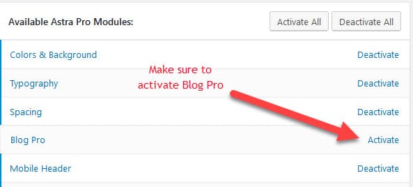
But before you can use these features, you need to activate the Blog Pro module in Astra Options.
To do so, go to Appearance > Astra Options and make sure the module is activated:
Once that’s done you’ll be able to follow along with the rest of this post.
Next, we’ll learn how to customize Astra archive page and review the following:
So let’s start with setting up a blog layout!
Set up a Blog Layout
1-Column Grid Layout Default
The archive page defaults to a 1-column grid layout with post excerpt underneath the featured image.
But this layout can really stretch your featured image. And it takes up too much real estate in my opinion!
Take a look:
So you’d have a series of large featured images with the excerpt underneath. And your visitors will need to scroll through the page, which doesn’t make for a good user experience.
Instead let’s take a look at a few other layout formats.
For example, you might want the excerpt on the left and image on the right with the 1-column grid layout like so:
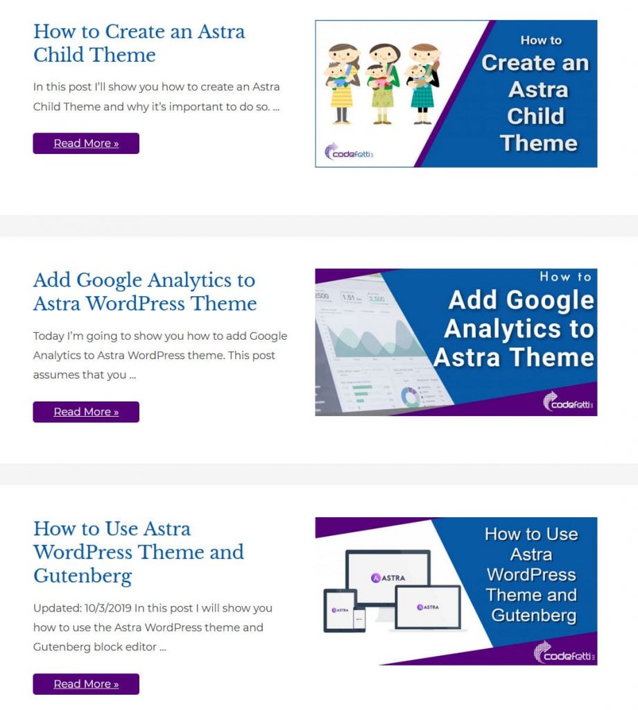
Looks a little better doesn’t it?
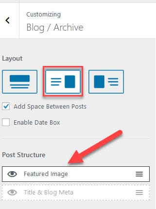
As you see in the example above, I chose the excerpt to the left of the featured image. And I want to show just the featured image with no meta data.
To change the blog layout, go to: Appearance > Customize > Blog > Blog / Archive as shown in the demo below.
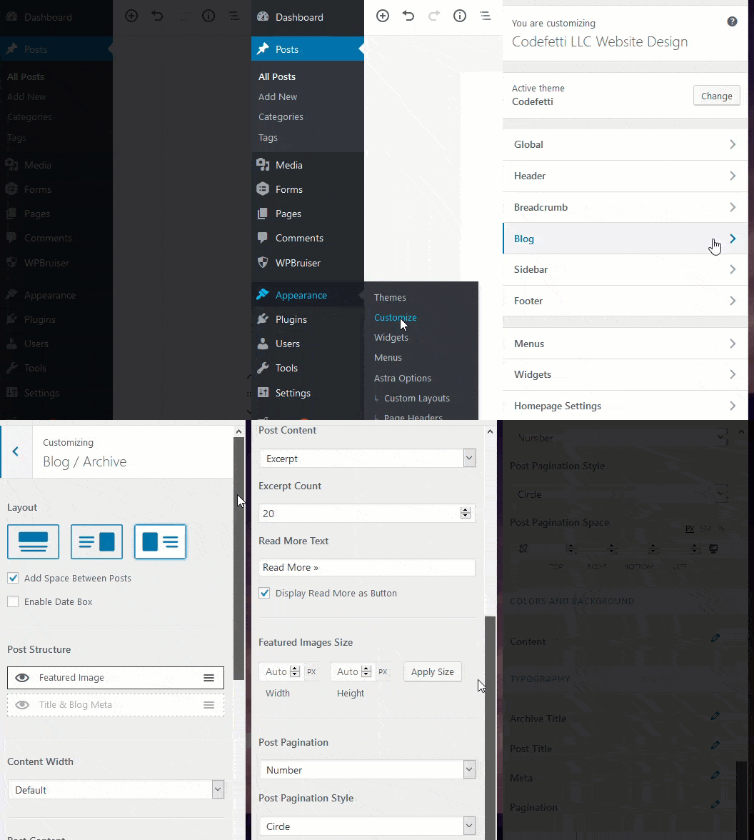
My example uses the following settings:
1-Column Grid Layout with Excerpt on the Left
And now you know how to create a 1-column grid layout!
Let’s create a 3-column grid layout next.
3-Column Grid Layout
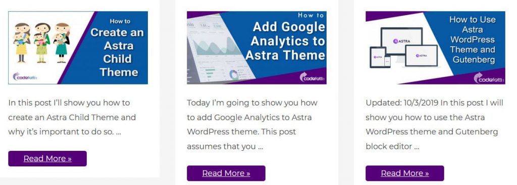
This layout would show your visitors three posts at a time within a given category.
Here’s what that would look like on desktop:
And you also have a choice of how those columns are styled.
Let’s look at the settings below to see how this is done.
First, select whether you want the excerpt below or to the right or left of the featured image.
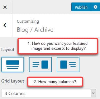
And you can see in the settings above that I chose featured image above excerpt in a 3-column grid.
So our example above displays three posts at a time from our “Astra” category with a Read More button.
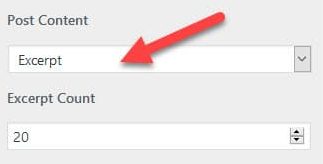
We also had to set the post content to “Excerpt” with an excerpt count of 20.
Here are the final settings:
Blog Post Structure

Keep in mind that the grid layout will change depending on the device the visitor is using.
So on a smartphone for example the columns will collapse and stack. And some of the styling for different devices may need to be adjusted in the media queries.
Let’s take a look at some of the other options as we continue to customize Astra archive page.
To Display the Date or Not?
Astra Pro has an option to display a date box on your posts.
Simply click the Enable Date Box checkbox and select whether you want it displayed in a circle or square:
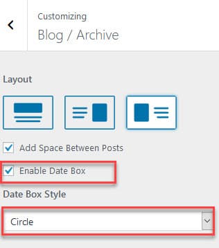
And here is an example archive page with the date on each post:

Hopefully by now you see how easy it is to customize Astra Archive Page with Astra Pro!
Modify Post Structure
You have the option to change the blog post structure so that the Featured Image appears first and Title & Blog Meta show under it. Or vice versa.
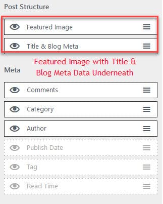
Next we’ll look at how you can modify your post structure and change the order in which your meta data displays.
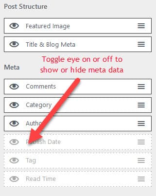
Reorder, Show or Hide Meta Data
Your meta data is information about your post such as the author, category, publish date, tag, read time, and number of comments.
You can also reorder the list of meta data like this:
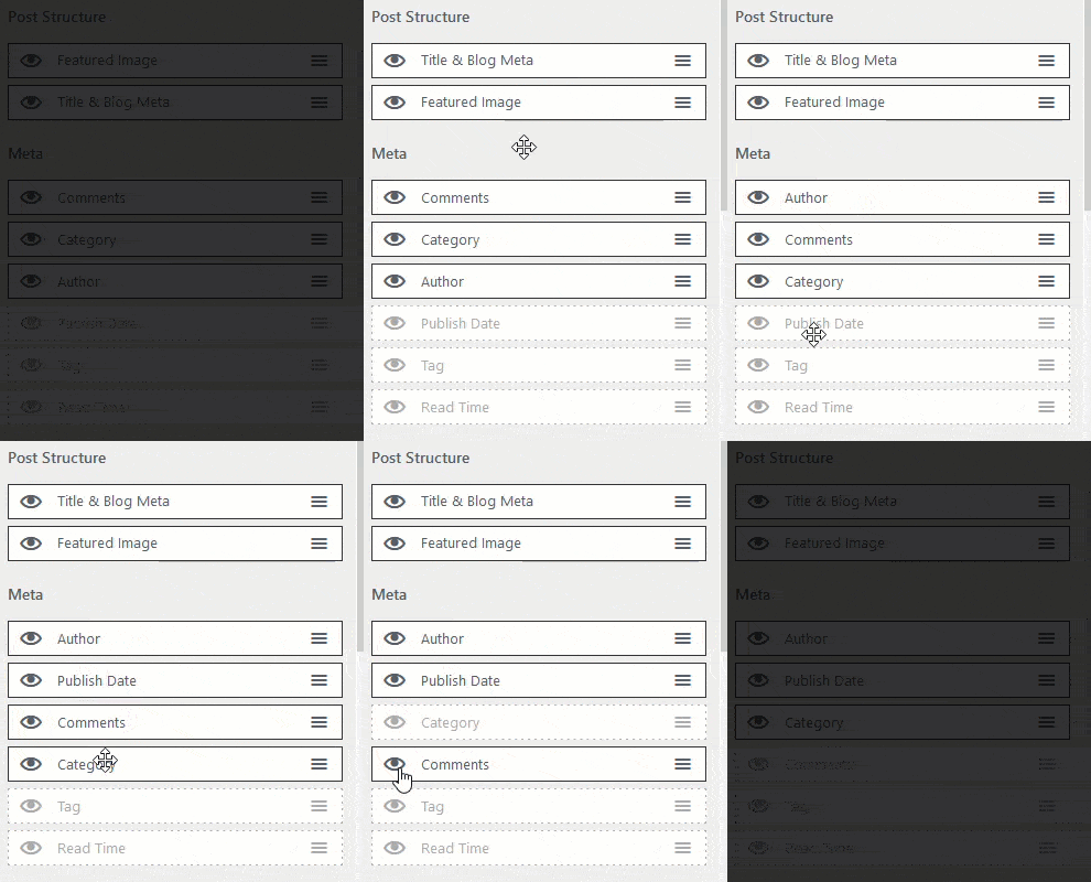
Choose which meta data you want to display on each post. That meta data includes:
Toggle the eye off or on to show or hide your meta data.
In the sample below I am hiding Publish Date, Tag and Read Time.
Next we’ll see how to format your blog post content on your archive page.
Blog Post Content
The written text of your blog post is considered its “content.”
You can select how much of this content you want to show on the archive page.
Your choice is full content or excerpt. In our case, we want an excerpt with 20 words. The default limit is 55 words.
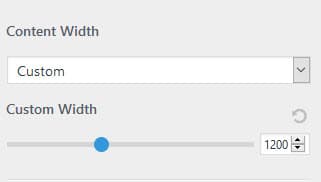
You can define the content width or set a custom width for your blog post.
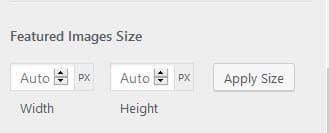
And you can specify your featured image size, too:
There are other spacing options which I am not going to cover in this post.
Use spacing options cautiously because you can affect the default media queries, which are the “rules” for how your pages show on smartphones and tablets.
Next let’s look at a few post pagination styles.
Post Pagination and Styles
It’s easy to customize your post pagination style. You can select infinite scroll so there is no pagination.
Or specify a number within a circle or square:
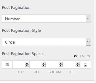
The above settings for post pagination results in this type of pagination:

It looks nice and it’s easy to do.
Colors and Background
You can further customize Astra Archive page by modifying any of the settings below.
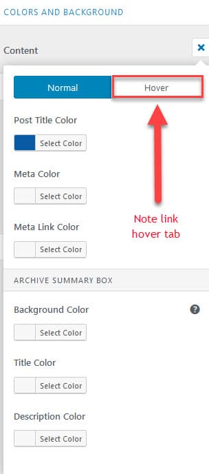
And it’s also very easy to do.
Have fun experimenting with the settings until you find just the right look for your archive page!
Typography
The following elements will inherit current font family and styling.
But you can change the defaults by modifying Typography settings as shown below:
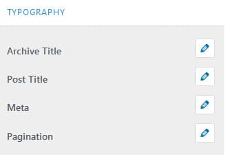
Click on the pencil icon next to the element you want to change.
Wrap Up
I hope by now you see how easy it is to customize Astra Archive Page with Astra Pro.
We’ve explored the major settings, how to change them, and the various looks you can achieve.
Experiment with the various layouts and settings until you have an archive page just how you want it.


